Quick answer
Usage-to-cost ratio measures how much active value you extract per dollar spent on a recurring tool or subscription. A high ratio means the tool earns its place. A low ratio is a signal to investigate. When a subscription scores near zero, it is paying to exist, not paying to perform.
Most teams review their SaaS spend once a year, usually when someone notices the credit card bill and asks "what is this?" That moment of recognition is always late. By then, you have paid for months of something nobody was using.
Stay Updated with Subtrakr
Sign up to our newsletter to get updates about Subtrakr and valuable insights about subscriptions and recurring expense management.
Usage-to-cost ratio is the metric that catches this problem earlier, before the cost compounds.
What Is Usage-to-Cost Ratio?
Usage-to-cost ratio is a per-subscription KPI that compares actual usage activity against the monthly cost of a tool.
The basic formula is:
Usage-to-Cost Ratio = Usage Score / Monthly Cost
Usage score can be any measurable activity proxy: logins per month, active users, features accessed, files created, API calls made, or hours logged. The exact metric depends on the tool category.
The output is not a magic number. It is a relative ranking. You are not calculating one score in isolation. You are building a small scorecard across your subscription stack so that underperforming tools become visible by comparison.
Why Most Teams Never Run This Calculation
The reason this KPI gets skipped is simple. SaaS subscriptions are low-friction to keep. Nobody cancels a tool mid-quarter because it feels disruptive. Nobody audits usage because it requires pulling data from multiple places. And nobody notices cost creep in smaller line items when they are buried across three different payment methods.
Subscription overload is partly a visibility problem and partly a measurement problem. Usage-to-cost ratio addresses both, but only if you build a lightweight system for tracking it.
How to Define Usage for Each Tool Category
Usage is not universal. A project management tool and a video conferencing tool have completely different activity signals. Here is a practical breakdown by category:
| Tool Category | Useful Usage Proxy |
|---|---|
| Project management | Tasks created or updated per month |
| Communication | Active users per month |
| Design tools | Files opened or exported |
| Analytics / BI | Reports viewed or dashboards opened |
| Storage / backup | Files uploaded or retrieved |
| Automation tools | Workflows triggered |
| AI writing / coding tools | Prompts sent or sessions opened |
| Accounting / finance | Transactions logged or reports exported |
| CRM | Contacts touched or deals updated |
| Documentation tools | Pages edited or viewed |
You do not need perfect data. You need consistent data. Even a rough monthly login count, pulled from a team admin panel or exported from an activity log, is enough to reveal which tools are being used and which are not.
How to Build a Usage-to-Cost Scorecard
This does not require specialized software. A shared spreadsheet updated once a month is sufficient.
Step-by-Step Setup (Time required: 30 minutes initially, 10 minutes monthly)
Step 1: List every recurring subscription in your stack.
Include cost per month, billing cycle, and the team or function it belongs to. If you are paying annually, divide by 12 to get a monthly equivalent. A subscription tracker template makes this step faster.
Step 2: Choose one usage proxy per tool.
Pick the signal that best represents active value for that tool. Document it. Keep the same metric each month so trends are visible.
Step 3: Pull or estimate usage data for the past 30 days.
Most SaaS tools surface usage data in their admin or billing section. If admin data is unavailable, use team self-report: ask the owner of each tool to rate usage on a 1 to 5 scale.
Step 4: Calculate the ratio.
Divide the usage score by the monthly cost. This gives you a relative rank, not an absolute score.
Step 5: Flag anything in the bottom quartile.
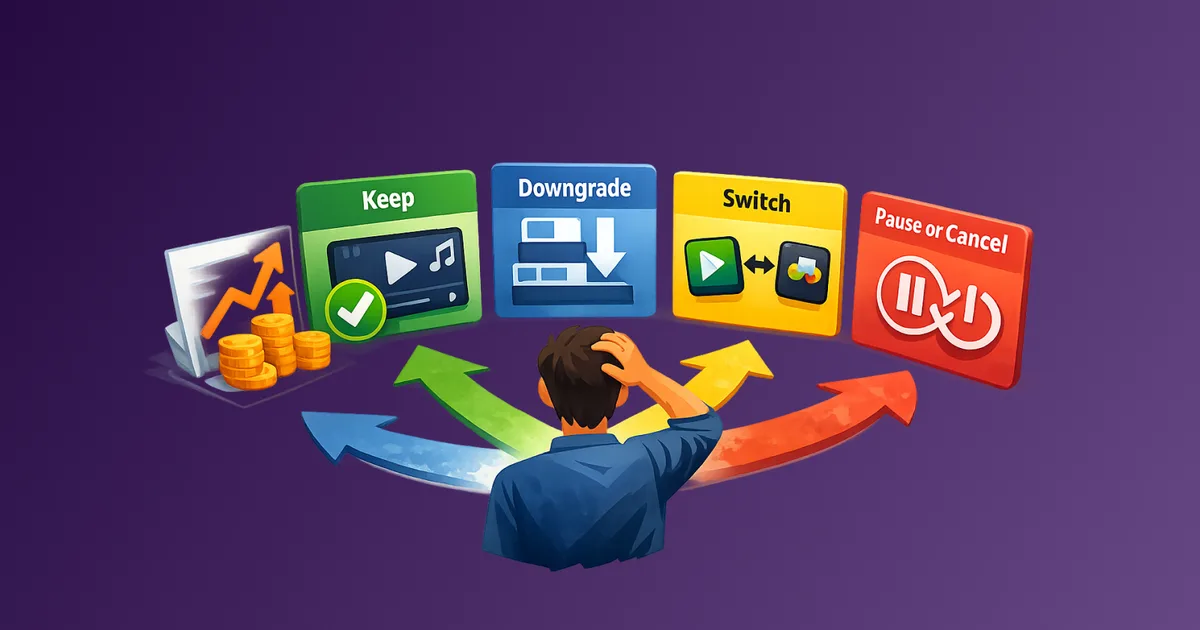
Sort by ratio. Flag the bottom 25% for a brief review. Ask two questions: Is there a legitimate reason for low usage? Is there a planned increase in usage soon? If neither is true, that tool is a candidate for downgrade, pause, or cancellation.
Step 6: Review monthly, adjust quarterly.
Usage trends matter more than single-month snapshots. A tool that drops for three consecutive months is a stronger signal than one that had a bad week.
Copy-Paste Scorecard Template
Use this format in a shared spreadsheet or Notion table.
Tool Name | Monthly Cost | Usage Metric | Usage Value (Last 30 Days) | Usage-to-Cost Ratio | Status
----------|--------------|--------------|---------------------------|---------------------|-------
Figma     | $45          | Files exported | 38                       | 0.84                | Active
Loom      | $12          | Videos recorded | 2                       | 0.17                | Review
Notion    | $32          | Pages edited  | 91                        | 2.84                | Active
Hotjar    | $39          | Sessions analyzed | 0                     | 0.00                | Inactive
Status options: Active / Review / Inactive / Cancel Pending
Review anything below 0.25. Investigate anything at 0.00.
What Low Usage-to-Cost Ratio Usually Means
A low score is a signal, not a verdict. Before cancelling, it is worth understanding why usage is low.
Common reasons for low scores that are fixable:
- Tool was purchased for a specific project that has not started yet
- The person who owned the tool left the team
- Onboarding was incomplete and the team defaulted to an older tool
- Usage is seasonal, not monthly
Common reasons for low scores that indicate a real problem:
- The tool was supposed to replace something but never got adopted
- A free or cheaper alternative is already doing the job
- The team outgrew the tool but kept paying out of inertia
- Nobody remembers what the tool was for
If the reason is fixable, set a 60-day review window and reassess. If the reason is structural, treat it as a cancellation candidate and move it through a proper cancellation checklist.
Common Mistakes When Running This Scorecard
Using cost as the only filter. Teams often focus only on high-cost tools when reviewing spend. But a $15 tool with zero usage is still waste. Usage-to-cost ratio catches low-cost inactive tools that would otherwise escape review.
Measuring usage once and drawing permanent conclusions. One month of low usage can be noise. Three months of declining usage is a trend. Build the habit of monthly tracking before acting on the data.
Treating the ratio as absolute. A ratio of 0.5 does not mean a tool is good or bad. It means it ranks lower than tools with a ratio of 2.0. The value is comparative, not standalone.
Ignoring seat count. If a tool has 10 seats but only 3 people are using it, the real cost per active user is three times what you are paying per seat. Factor active users into the usage metric when seat-based pricing is involved.
Skipping tools with annual billing. Annual subscriptions feel like sunk costs once paid. They are not. If usage drops significantly mid-year, that is still information you need. It affects renewal decisions and justifies downgrade conversations with vendors.
How This Connects to Your Recurring Expense Workflow
Usage-to-cost ratio is most powerful when it sits inside a broader recurring expense review system. It answers the "are we getting value" question. Other parts of the system answer what you are paying for, whether you are on the right billing cycle, and how spend is structured.
Usage-to-cost ratio answers "is this tool earning its place?"
Together, these form a recurring expense management workflow that prevents both surprise costs and quiet waste.
FAQ
What is a good usage-to-cost ratio?
There is no universal benchmark. The goal is relative ranking across your own stack. Tools consistently in the bottom quartile of your scorecard deserve review, regardless of their absolute score.
What if I cannot pull usage data from a tool?
Use a simple team self-report on a 1 to 5 scale. Ask the primary users: how often did you use this tool in the last 30 days? Even subjective ratings reveal patterns when tracked consistently over time.
Should I include free tools in the scorecard?
Free tools with zero cost create a divide-by-zero problem in the formula. You can log them separately as "no-cost active" or "no-cost inactive" tools. If a free tool is replacing something you pay for, that is worth noting.
How often should I run this review?
Monthly data collection, quarterly scoring and decision review. Monthly tracking ensures you catch trends. Quarterly reviews give you the context to act on them without over-reacting to single-month noise.
Does this apply to personal subscriptions too?
Yes. The logic is the same. Replace "active users" with "times used per month" and "team admin panel" with "your own recall or app screen time data." The score will be rougher but still useful for ranking which subscriptions are earning their place.
What do I do with tools that score low for seasonal reasons?
Flag them with a note and a review date. Seasonal tools should spike during their relevant period. If the next season arrives and usage is still low, that is a clearer signal.
Next Step
Pull your current SaaS stack, add one usage proxy per tool, and score it this week. You do not need a perfect system to get started. You need one pass through your subscriptions with a consistent question: is this tool earning what we pay for it?
Subtrakr makes it straightforward to track the cost side of this equation. Add your recurring expenses, assign categories, and use the monthly equivalent view to see what your stack actually costs before you layer in the usage data.