Quick answer
A renewal risk heatmap is a one-sheet view that scores each recurring contract on three dimensions (spend size, how critical the tool is to operations, and how close the renewal date is) and combines them into a single color-coded risk rating. Instead of scanning a flat list, the team sees, at a glance, which renewals carry the highest combined risk and should be reviewed first.
Finance and ops teams tracking dozens of vendor contracts face the same problem every quarter: renewals are scattered across a spreadsheet, sorted by date or by amount, but never by both at once. A $200 tool renewing next week and a $40,000 platform renewing in two months can look equally urgent, or equally invisible, depending on how the list is sorted. A renewal risk heatmap fixes this by combining three factors, contract value, business criticality, and time to deadline, into a single visual score that tells you what actually needs attention first.
Stay Updated with Subtrakr
Sign up to our newsletter to get updates about Subtrakr and valuable insights about subscriptions and recurring expense management.
What Problem Does a Heatmap Solve That a List Doesn't?
A sorted list only ranks by one variable at a time. Sort by amount and you miss the small-but-mission-critical tool renewing tomorrow. Sort by date and you miss the large contract with three months of runway that still needs a renegotiation decision this week.
A heatmap solves this by scoring all three variables together and rendering the result as color, so pattern recognition happens visually instead of through manual cross-referencing. Multi-entity finance teams managing recurring expenses across departments benefit the most, since the number of active contracts makes manual triage impractical.
What Three Inputs Does the Heatmap Need?
The heatmap needs exactly three inputs per contract. Adding more turns it into a spreadsheet again, which defeats the purpose.
- Renewal amount: the monthly cost equivalent or annual contract value, whichever your team standardizes on
- Criticality: how disruptive it would be to operations if the tool disappeared tomorrow
- Time to deadline: days remaining until the renewal or cancellation window closes
Each input gets its own simple scale, and the three scales combine into one number. Keep the scales small. A 1 to 3 or 1 to 5 range is enough resolution for a decision tool; anything finer just adds friction without adding accuracy.
How Do You Score Criticality Without It Becoming Subjective?
Criticality is the input teams struggle with most, because "important" means different things to different stakeholders. The fix is to define criticality by operational dependency, not by opinion.
A simple 1 to 3 scale works well:
| Score | Definition |
|---|---|
| 1 | Nice-to-have. Team could operate without it for weeks with minor workaround. |
| 2 | Important. Losing it disrupts a workflow within days and requires a real substitute. |
| 3 | Critical. Losing it stops a core process immediately (payroll, invoicing, production systems). |
Assign this score once per tool, not once per renewal cycle. Criticality rarely changes quarter to quarter, so this becomes a stable reference column you only revisit when a tool's role in the stack actually shifts.
How Do You Score Deadline Urgency?
Deadline urgency should reflect how much runway is left to make a decision, not just the raw days-to-renewal number. A contract with a 60-day notice period and 45 days left is already past the safe decision window, even though the calendar date feels far off.
A practical scale:
| Score | Trigger |
|---|---|
| 1 | More than 60 days before the decision deadline (notice period plus buffer) |
| 2 | 15 to 60 days before the decision deadline |
| 3 | Fewer than 15 days, or already inside the notice window |
This is where a renewal calendar and the heatmap connect directly. If your team already tracks renewal dates and notice periods on a calendar, that same data feeds this column without extra work.
How Do You Combine the Three Scores Into One Risk Rating?
Multiply the three scores together rather than adding them. Multiplication rewards contracts where every factor is high and prevents a single high score from dominating the result unfairly.
Risk score = Amount score x Criticality score x Deadline score
With a 1 to 3 scale on each input, the combined score ranges from 1 (all low) to 27 (all high). Bucket the result into three bands for the color coding:
| Combined Score | Band | Color |
|---|---|---|
| 1 to 6 | Low risk | Green |
| 7 to 15 | Medium risk | Yellow |
| 16 to 27 | High risk | Red |
A contract with high spend, high criticality, and a tight deadline lands in red no matter how it's sorted. A small, replaceable tool with months of runway stays green even if the raw dollar amount looks worth noticing on its own.
Step-by-Step Setup (Time required: 15 minutes)
- List every active recurring contract in one column. Use your existing recurring expense tracker as the source so nothing gets missed.
- Add three score columns: Amount, Criticality, Deadline. Score each contract 1 to 3 using the definitions above.
- Add a formula column that multiplies the three scores together.
- Apply conditional formatting to the combined score column: green for 1 to 6, yellow for 7 to 15, red for 16 to 27.
- Sort by the combined score, descending. Red rows go to the top automatically.
- Review red and yellow rows first in your next renewal or spend review meeting. Green rows can wait until the next cycle.
Rebuild the amount and deadline scores whenever you refresh the tracker. Criticality only needs a check when a tool's role changes. Once the priority list is clear, roll red and yellow renewals into recurring spend scenario bands so leadership sees best/base/worst cash impact, not only which contracts are urgent.
Copy-Paste Heatmap Template
Contract | Amount ($/mo) | Amount Score | Criticality Score | Deadline Score | Risk Score | Band
---------|---------------|--------------|-------------------|----------------|------------|------
[Tool A] |               | 1-3          | 1-3               | 1-3            | =A*C*D     | Auto (color)
[Tool B] |               |              |                    |                |            |
[Tool C] |               |              |                    |                |            |
Amount score guide: 1 = below your team's low-spend threshold, 2 = mid-range, 3 = above your high-spend threshold. Set the thresholds to match your own budget scale rather than a fixed dollar figure, since a $500/month contract is a rounding error for some teams and a major line item for others.
Common Mistakes That Undermine the Heatmap
- Scoring criticality by loudness, not dependency. The tool the loudest stakeholder complains about isn't always the one that actually breaks a process. Anchor criticality to what stops working, not who asks first.
- Adding the scores instead of multiplying them. Addition lets a high score in one dimension mask two low scores in the others, which defeats the point of a combined view.
- Letting the deadline score use calendar date instead of notice-adjusted date. A renewal that looks 50 days away can already be inside a 60-day notice window. Always subtract the notice period first.
- Rebuilding the whole sheet every cycle. Criticality is stable; only amount and deadline need regular updates. Treat it as a living view, not a one-time report.
- Skipping the review meeting. A heatmap that nobody looks at before renewals hit is just a colorful list. Pair it with a short recurring review, even 15 minutes, focused only on red and yellow rows.
FAQ
What's the difference between a renewal risk heatmap and a renewal calendar?
A renewal calendar tracks dates and reminders. A heatmap adds a risk dimension on top, combining date urgency with spend and criticality so the team knows which upcoming renewals need attention first.
How often should the heatmap be updated?
Update amount and deadline scores whenever you refresh your recurring expense tracker, typically monthly. Criticality only needs revisiting when a tool's operational role changes.
Can this work with more than three input factors?
It can, but each added factor makes the color coding harder to read at a glance. Three factors keep the heatmap fast to build and fast to scan, which is the point.
Does the heatmap replace a full recurring expense audit?
No. The heatmap is a prioritization layer that tells you where to focus an audit first. The audit itself still needs the full detail behind each contract.
What spreadsheet tool works best for this?
Any spreadsheet with conditional formatting works, including Google Sheets and Excel. The formula and color logic described here transfer directly to either.
Should every team member see the same criticality scores?
Criticality should be agreed on once, ideally with input from whoever owns the workflow the tool supports, and then documented so it doesn't get re-litigated every renewal cycle.
Next Action
Build the heatmap once this week using your current recurring expense list. Score criticality and amount for every active contract, add the multiplication formula, and apply the three-color conditional formatting. Bring only the red and yellow rows to your next spend review meeting.
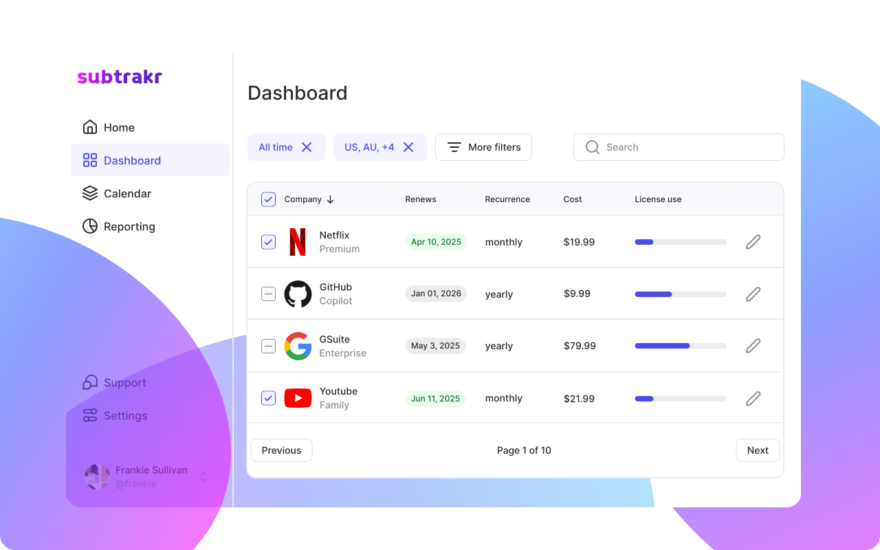
If your team already tracks recurring expenses in Subtrakr, the amount and renewal date data needed for this heatmap are already in the tracker, ready to drop into the sheet without re-entering anything.